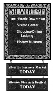
The public had an opportunity to view and offer feedback on a proposed system of signs and city markers to replace Silverton’s current conglomeration at a Feb. 10 meeting.
Silverton Community Development Director Steve Kay explained and illustrated the ideas on the table for implementing Silverton’s Downtown Signage Master Plan.
He said due to its proximity to Silver Falls State Park and The Oregon Garden and Resort, Silverton is sometimes discovered randomly by tourists, yet in most cases they’ll do as the signs indicate – just move on through to their destination.
The goals of the new signage plan are to:
• Attract visitors to the downtown core. Increase sign legibility and make it easier for people to find their way around;
• Reduce the clutter of as many as six signs stacked on a single pole;
• Develop a consistent and unique design to convey information to visitors – including the invitation to explore Silverton’s historic downtown and its services, shopping, dining and lodging opportunities.
After taking inventory of Silverton’s existing signage, the city formed a committee of business owners, citizens, Silverton Chamber of Commerce representatives, city staff and members of the planning commission and city council, enlisting them to draft a master plan.
Participants brainstormed ideas in regard to Silverton’s historic architecture, its natural environment and the nature of its residents, Kay said.
“Charming, quaint, small town, historic, artistic, quirky, both conservative and progressive,” and nestled between “farmland and forest” were identified in discussions.
“As the committee thought about this, these descriptions kind of reminded them of another familiar place,” Kay said. “Perhaps Silverton is a little like Oregon’s version of the TV show Northern Exposure.”
Working with graphic artist Barry Shapiro, the team came up with a design it felt is representative of Silverton: unique, eye-catching and functional.
“It has the appearance of an old, historic picture frame,” Kay said. The signs are recommended to be constructed of metal with a high resolution image applied to the surface. This method will allow for destinations to be added or changed.
“Without overtly doing so, the signs incorporate the charm, quirkiness, artistic nature and historic qualities of Silverton,” Kay said.
